kindercountry.de
- Project: kindercountry.de
- Date: March 2008
- Client: Ferrero kinder country
- http://kindercountry.de/
“…the living is easy, fish are jumpin’…” . These words of George Gershwin may come to your mind when visiting kindercountry.de. The fast and flashing web-world slows down a little bit and lets you dive into sunny landscapes, blue skies with white clouds, old trees on green hills,…
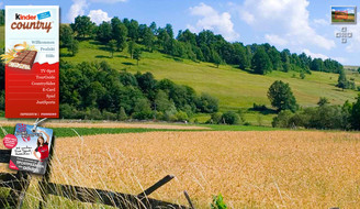
Just navigating through the high-resolution photographs makes you think you’d hear birds singing, crickets chirping and the gurgling of a clear water creek.
Drop your shoes and you’ll feel the grass caressing your toes and this gently blowing wind carrying the scents of apple blossoms and recently mowed meadow…
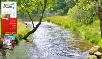
- Sorry to interrupt your dreams, but we’ll have to get back to business now. Because after all this is a high tech flash based website that uses cutting edge technology to load huge images and to give the user nearly limitless navigation possibilities.
The “TourGuide” gives a nice bird’s eye view of a quite big area. Real satellite images have been carefully combined with additional graphics to design the map. Rotating windmills, planing gliders and that little red car slowly driving along the road all the way through the whole image are nice details that give the view a very natural taste and the feeling of flying over real landscapes. Here’s this little elegance popular map providers (with double-Os in their name) lack…
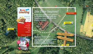
A similar effect is created by the white clouds that first hide the low-resolution parts – when the higher resolution images are loading – and then smoothly vanish and give a clear view of the now pixel-free map. Makes you think you just dropped out of a plane, hoping your parachute will open…
More than twenty locations, called “CountrySides”, can be chosen from the overview map. They carry inspiring names like “Schwanensee” or “Bruchweiher”. Each of them consists of a high-resolution photograph that usually cannot be displayed entirely in the browser, but thanks to the special loading technology here you can. What the visitor thinks is the complete image turns out to be only a fraction – the rest can be discovered bit by bit by panning with the mouse or using the navigation elements. A white “peephole” in the middle of each image contains animated abstract drawings like a kite dancing in the sky at “Schwalbenhang” or the book on a picnic blanket whose pages are turned by the wind at “Krähenwinkel”. They seem to be a look into what the visitor might dream of while looking at the image, and finally the scenes come alive.
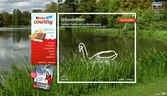
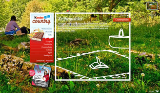
As in real-life rambling, not every “CountrySide” is part of the guided tour. There’s always more to discover:
E-Cards written into the sky by toy planes, cows that have to be shooed back into their barn…just try for yourself.
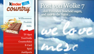
There is a natural limitation in showing large images on the internet: transfer time for big data masses and technical limitations of the displaying software, i.e. the browser or the flash plugin. The MESO-team managed to overcome these limitations by combining an elegant queuing mechanism with large images split into smaller tiles. The parts of an image are loaded into the browsers cache, but are only loaded into memory when they are actually displayed – to keep the RAM usage low.
Add some XML-based anchor points that point to other parts of the site and you have a system that can use huge images as a beautiful or helpful background for an explorative menu. In this case we show nice landscapes, but the same system can be used to display technical documentation, architecture, you name it. Anyway, it makes flickr’s note system look like a schoolboy’s scrawl…
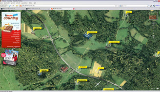
All satellite imagery used with friendly permission by "GeoContent ":http://geocontent.de/ GmbH
If you like this taste you might also have a look at:
These are characters of the penguins we developed for use on the kinder pinguí website
Little promo game for Ferrero in good old "breakout"-manner.
A snow island playground designedfor a CD-ROM giveaway by kinder pinguí chocolate bars.
A classical two pane compare images game made in Flash.
Flash application where one can participate in an online raffle and get instant feedback about his win
The "MakingOf" the Kinder Pinguí TV Spot.
Promo game for Ferrero: Find out the pairs of snow flakes.
Our little flash game may look like a piece of cake. But it will put to the test even professional and experienced gamers.
"Tiefseetaucher" is kind of an underwater-version of good old jump'n'run games.
Tour de Pinguí is a single player game developed for Ferrrero.
Completing a puzzle showing a lovely photograph of little penguin's family will give you the solution word.
What do you know about our friends, the penguins? A little questionnaire for Kinder-pinguí with funny questions and nice illustrations.
Another little promo game: Find out where mother penguin lives with her husband and the two children.
One of the educational games embedded in kinder-pinguí.de
Online raffle and audiobook library where you can download audiobooks for Kinder-pinguí codes.
A promotion for a painting book produced by Kinder-Pinguí Russia
Flash application for Ferrero Russia to accompany the movie start of Kung Fu Panda with sophisticated animations
Flash application for Ice Age 3 promotion in Russia with interactive elements made out of fresh artwork
Microsite for FERRERO football promotion in 2006. Win your personalized football shirt by allocating metaphors
Kinder-pinguí multiuser environment.
A Flash 3D community for children.


